
At Telefónica, we believe that accessibility is a shared responsibility. Our Accessibility Catalog is an open-source initiative designed to help developers create more accessible Android applications. Through collaborations and community contributions, the catalog continues to grow, offering practical examples and best practices for implementing accessibility features.
In a previous post, “Improve your Android accessibility with toggleables we explored how to make custom toggleable components (like Switches and Checkboxes) more accessible. Since then, the catalog has seen exciting new additions, especially around content descriptions and state descriptions—two pillars of accessible UI.
How to use content descriptions effectively
Custom UI and rich visuals are everywhere in modern Android apps: illustrations, icons, charts, status indicators, decorative assets…
However, when accessibility is overlooked, many of these visual elements become invisible or confusing to users who rely on screen readers like TalkBack.
In this article we’ll discuss how to correctly use content descriptions in Android, explaining when to provide them, when not to, and how to adapt them to context. We’ll use real examples implemented in the Accessibility Catalog so you can directly apply these ideas to your own apps.
Before starting
All accessibility tests shown here were performed using TalkBack, Android’s most common screen reader.
The concepts and APIs described are framework‑level, so they apply to any Android accessibility service.
What is a content description?
A content description is alternative textual information that describes a UI element for assistive technologies.
It allows:
- Users of screen readers to understand what an element represents
- Screen readers to convey purpose, context, or action, not just visuals
In Android:
- Views use android:contentDescription
- Compose uses contentDescription or Modifier.semantics {}
But simply adding descriptions everywhere is not enough — and can even harm the experience if done incorrectly.
Let’s get started
Imagine we have a screen containing:
- Weather illustrations
- Action icons
- Decorative elements
- Complex charts
- Status indicators
- Phone numbers
Visually, everything looks clear. But how does TalkBack experience this screen?
Without careful content descriptions:
- Icons may be announced as “Image”
- Important context may be lost
- Redundant information may be read multiple times
- Decorative visuals may add unnecessary noise
1. Meaningful descriptions for informative images
If an image conveys information, it must have a meaningful description.
Example:
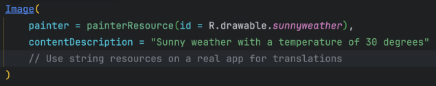
Result in TalkBack:
“Sunny weather with a temperature of 30 degrees”
This explains what the image means, not just what it looks like.
Avoid generic descriptions like “Weather icon” or “Image”. Describe the information value.
2. Actionable icons must describe the action
Icons used as buttons should describe what happens when activated, not the icon itself.
Example:
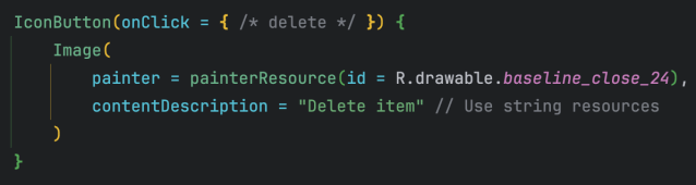
TalkBack announcement:
“Delete item. Button.”
Rule
Describe the action, not the visual.
A cross on the “Close icon”
A tick next to “Delete item”
3. Decorative images should be ignored
If an image is purely decorative, it should not be announced at all.
Example:
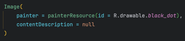
Result: TalkBack skips it entirely.
Decorative elements add visual polish, not information — so keep the accessibility experience clean.
4. Complex graphics need contextual descriptions
Charts and infographics often can’t be understood visually by screen readers.
Instead of describing shapes or colors, summarize the meaning.
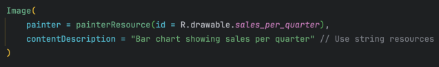
TalkBack:
“Bar chart showing sales per quarter”
For very complex data, consider:
- A summary description
- Or an accessible text alternative nearby
5. Avoid redundancy with visible text
One of the most common mistakes is duplicating announcements.
Avoid:
[Icon: Delete] [Text: Delete item]
Both elements expose the same content description → TalkBack reads “Delete item” twice.
Correct approach: Group semantics
In Compose, it is recommended to group semantics at the parent container level to avoid duplication or noise in accessibility announcements.
There are two approaches depending on the level of control needed:
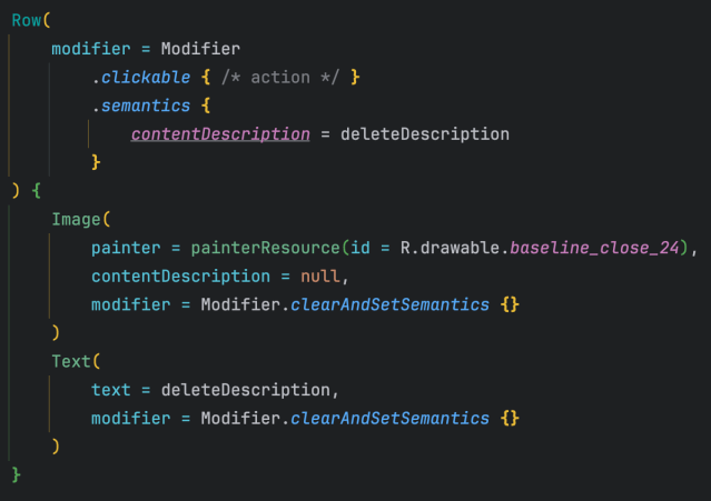
Option 1: Explicit control of semantics
When full control over the final output is required (for example, to avoid duplication or completely redefine the message), you can clear the semantics of the children and define them on the parent container.
Result:
“Delete item”
Announced once, clearly.
Option 2: Using mergeDescendants
In simpler cases where the semantics of the child elements are already correct, you can use mergeDescendants = true to automatically combine the information into a single accessible node.
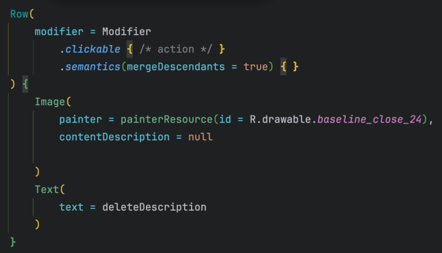
This approach is more concise, but relies on the child semantics not producing duplicate or unnecessary announcements.
6. Context-aware descriptions
Descriptions should adapt to state or context.
Example: a status indicator
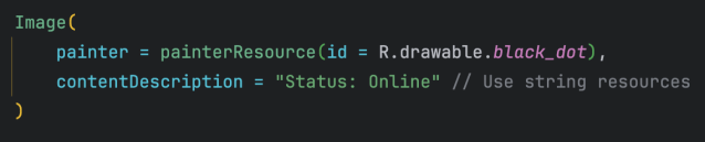
TalkBack:
“Status: Online”
Without context, a “green dot” means nothing to a screen reader.
Note: Although the content represents a “state”, in this case `contentDescription` is used because the element is an image with no inherent semantics.
We will cover `stateDescription` later, which should be used when the state is part of an interactive component or one with a defined role (for example, switches, checkboxes, or elements grouped with text).
7. Phone numbers: improve how they are read
By default, TalkBack may read phone numbers as a single long number.
Default behavior
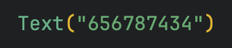
“Six hundred fifty-six million seven hundred…”
Improved with contentDescription
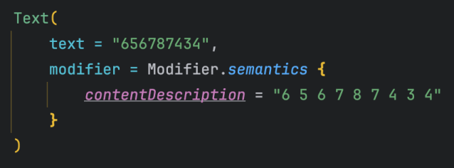
TalkBack:
“6… 5… 6… 7… 8… 7… 4… 3… 4”
Much clearer and easier to follow.
Key takeaways
- Use meaningful, contextual descriptions
- Describe what an element does, not how it looks
- Don’t describe decorative visuals
- Avoid redundancy with visible text
- Adapt descriptions to state and context
In summary
Content descriptions are a small detail with a huge impact on accessibility.
When done well, they turn a visually rich but inaccessible UI into an experience that everyone can understand and enjoy.
This article is based on a real contribution to the Accessibility Catalog, where you can explore compose examples and side‑by‑side correct vs incorrect patterns.


