Accessibility in Android Development

In today’s digital age, accessibility in mobile app development isn’t just a feature; it’s a necessity. As developers, our goal is to create applications that are not only functional but also inclusive, ensuring that everyone can engage with our products seamlessly.
In this post we are going to explore key strategies and best practices for making our Android apps more accessible and user-friendly.
1. Introduction
What is accessibility in mobile apps?
An app’s accessibility is its ability for all people to use its features and access its content regardless of their technical, physical, or cognitive disabilities. In other words, it seeks to make it accessible to all people, including users with some type of disability.
It is important not to confuse accessibility with usability. While usability refers to the conditions of the app that make it attractive and user-friendly for the user, accessibility relates to the app’s ability to be used by any user.
To make your application accessible, you will not only have to comply with certain rules regarding the colors used, contrast, size and scalability of the text fonts, etc. You will also need to implement configurations so that voice assistants such as TalkBack (Android) or VoiceOver (iOS) are able to give the necessary information to users.
In this post, we’ll focus on Android and how to work with accessibility APIs and specifically how Talkback works.
Why is it important for your app to be accessible?
In recent years and increasingly, the digital world has become part of our daily lives and there are more and more digital services. Services, used by everyone and that, therefore, need to be accessible to everyone.
To give an example, just as it is necessary to have an entrance for the disabled in a school, residential building, etc, we need digital apps and services to be accessible.
Another important point can be economical and thus you will get your application to be used by as many users as possible. In Spain, it is estimated that around 2% of the population has some degree of visual impairment.
Last but not least, the European accessibility body has established a regulation by which on June 28, 2025, all digital products and services must be accessible with a minimum requirement of WCAG 2.1: AA+, otherwise penalties of up to 1 million euros per product will be applied.
Accessibility today
Today, the reality is that almost no app is 100% accessible. According to a study, 47.4% of the 50 most used applications are not accessible. Minimal contrast, visible focus, and text size are the most common issues.
As for operating systems, it can be said that iOS is more accessible but the high price makes Android the most used system.
2. Top accessibility tools on Android
As we mentioned at the beginning, in this post we will focus on how to work with Android accessibility APIs and how the TalkBack tool works.
However, TalkBack isn’t the only accessibility tool with which to make an Android device accessible. There are also tools such as BrailleBack and Switch Access.
BrailleBack began as an application that connected a braille screen to the mobile device. Nowadays, if you have a braille screen you don’t need the BrailleBack app. You can connect via Bluetooth and together with TalkBack to combine both braille and voice screen reading.
Switch Access is intended for people with reduced mobility. It is also known as switch accessibility and allows you to use the mobile device with one or more external buttons instead of using the touch screen, and even through gestures that allow you to perform a predetermined action.
These tools connect to our mobile application through the Android Framework, allowing us to implement their use in the simplest possible way through a few commands.

3. Accessibility guidelines for mobile apps
Screen size and font
Although the WCAG 2.1 compliance criteria do not specify a specific minimum font size for texts, Google recommends that texts in Android mobile applications should have a minimum of 12 sp (scale-independent pixels), while Apple recommends the use of a minimum of 11 pt (typographic dots).
However, WCAG 2.1 does require that there must be sufficient contrast for the text to be readable under various conditions, and, above all, that the text must be scalable.
Every user should be able to modify the font size from their device settings, being able to set a text scale of up to 200%. So it is mandatory that the size of the texts is defined in sp’s.
By applying the sp’s on the texts at the beginning of the text scale, the Android Framework is responsible for managing it invisibly since it multiplies the sp’s established in each of the fonts by the value of the font scale (Value that ranges from 0.6 to 2.0, depending on what is selected by the user). So the developer shouldn’t worry about it beyond setting the size of these in SP’s… Or should they?…
Most mobile apps fail at this point because developers don’t prepare their apps for this font scaling that Android does. Usually the text pops out of the screen or the defined blocks, cuts off and loses text inside the blocks, or covers other important sections or buttons. etc.
For this point we give several tips:
- Do not enter texts in blocks with a fixed size: these blocks must always be adjusted to the size of the text, so that if it grows, it grows at the same time as the block.
- Manage overflows: add scroll to the text and the blocks that surround it, both vertical and horizontal, to avoid losing information.
- We recommend the use of dimens.xml files where the sizes of all the fonts are established so that depending on the screen size the texts have one font size or another.
- Test the app on devices of different sizes and try to see the text with minimum and maximum Zoom size and check that everything is working correctly.
Color Schemes
In an Android application we can define a color scheme. We can even define one scheme for dark mode and another scheme for light mode. And we can apply both to the app’s theme.
The advantages of defining our color scheme is that each element of our app (texts, background colors, buttons,…) will have the color we have defined in our scheme.
In each scheme we can define the colors from already established labels, with which we can define the primary color of the app, the background, etc.
As in the following example:

In addition, the chosen colors are also important to make an accesible app. We have to take into account the possible visual limitations of users and choose colors with a high level of contrast and brightness and that avoid color blindness problems.
Minimum size of pulsable elements
It is highly recommended that the clickable elements have at least 48 dp x 48 dp (density- independent pixels) in size, either because the element occupies that size or because a padding has been added around it to reach that size, since otherwise for people with some type of motor disability it is extremely difficult to operate these buttons.
For this it is also recommended to use , a class that allows you to define a rectangular area around a view that also responds to touch events as if they were on the original view.
4. TalkBack
How does TalkBack work?
When you activate TalkBack on your device, the system dictates all the elements on the screen. One of the elements will have the focus of TalkBack and as the user changes the focus between the different elements, the system will dictate the information of each of them and allow you to act on them with gestures, such as giving 2 taps to activate a button.
This is an official video where Google explains how TalkBack works:
Main gestures
When you activate TalkBack, there are different gestures that allow you to move around the screen to iterate through all the elements.
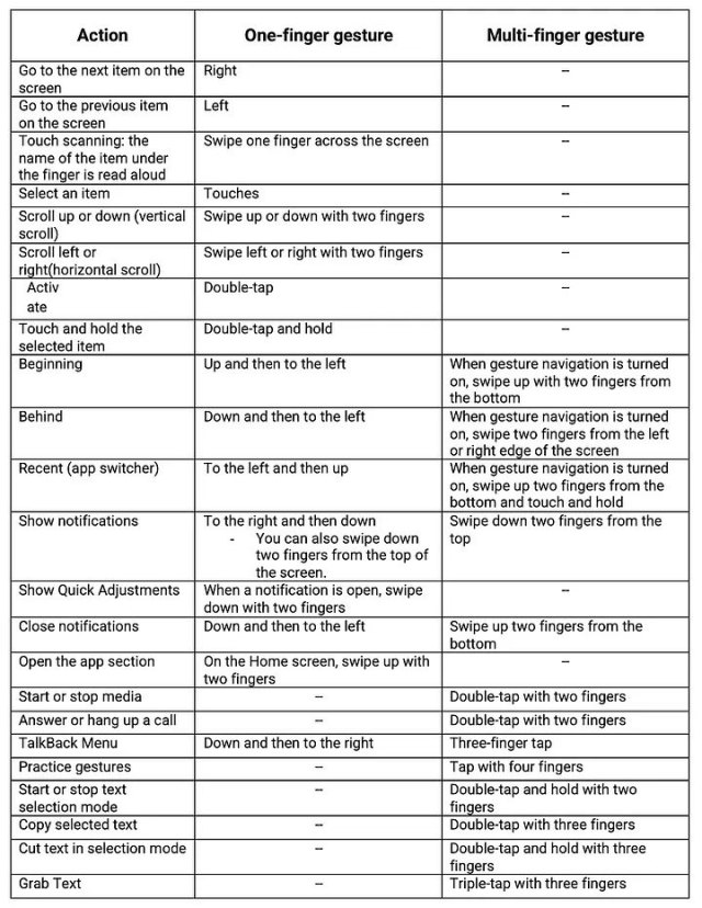
Item Information
Once we have learned the gestures that allow us to move around the screen and navigate when we have TalkBack activated, it is time to know what information TalkBack will tell the user. This information will provide a description of the item to know what item it is and what the user can do with it.
These are the semantic properties of the element such as the content description and click tags.
When TalkBack selects an item, it captures a description of the item by accessing the content description and click tag mentioned above. These semantic properties have default value, which will be read by TalkBack.
This information is configurable and will be what we will see in this post.
5. Android Framework
Within Jetpack Compose, all accessibility functionality is primarily managed through the use of semantics.
Next to the composition, there is a parallel tree, called a Semantic Tree. This tree describes your UI in an alternative way that can be understood by accessibility services and the testing framework.
Accessibility services use this tree to describe your app to users. The testing framework uses it to make assertions about your app.
The semantic tree does not contain the information for drawing the composable elements, but it does contain information about the semantic meaning of those elements.
To modify this semantic tree, Android provides us two Kotlin extension functions: semantics and clearAndSetSemantics.
Both have the same functionality, they allow us to modify the semantic values we want, with the only difference that clearAndSetSemantics “breaks” the hierarchy that has that element underneath.
For example, if we have this component:
Box(
  Modifier.clearAndSetSemantics {
    contentDescription = “Test”
  }
){
  Column {
    Text()
    Text()
    Box {
      ...
   }
  }
  Row {
    Button() {
      ...
    }
  }
}
In the semantics tree there will only be a Box with the description of “Test”, so Talkback will only detect “Test”, ignoring the blocks inside it (texts, buttons, etc).
Important: as we have mentioned, the testing tools also depend on this semantic tree, so you have to be especially careful with the use of clearAndSetSemantics as you can leave elements totally unreachable for UI tests.
Manage voice-over
The default labels provide very fair and general information. By not providing a specific detail, the user may not be clear about what and how to use your application. That is why we must pay special attention to the modifiers that the Framework provides us in order to provide information to our components. The most important tag that we will find in this Framework is the one mentioned in the previous point: contentDescription. This modifier allows us to replace the default Talkback speech.
For example, if we have a text like this:
Text(
    "This is a test",
     modifier = Modifier.semantics { contentDescription = "Hello World" }
)
Talkback will read Hello World instead of This is a test.
There are other elements such as buttons which have default text. For example, if we find a button with the test “Get started”, TalkBack will read by default: “Get Started, button. Double-tap to activate.”
According to Android’s logic, these texts are constructed as follows: “(contentDescription), Button, double click to (onClick button label)”.
Here’s an example of how it would work: if you want this speech for your button: “Hello world, button. Double click to say hello”, the button would have to be modified as follows:
Button(
  edit = edit.semantics {
    contentDescription = “Hello world”
    onClick(“say hello”) { false }
  }
)
Manage actions
We can modify the operation of the button when we click on it. The onClick function follows these rules:
onClick ([button label]) {
  [additional actions 1]
  [additional actions 2]
  [additional actions ...]
  [additional actions N]
  [true/false]
}
Inside you can add all the actions you want when you click on the element. Finally, you have to return a Boolean which refers to whether you want the click action to propagate to the parent components.
Here are several examples:
Case 1:
IconButton(
  modifier = Modifier.semantics {
    contentDescription = stringMuteButton
    onClick(stringMuteMicro) { testAction(); true }
  },
  onClick = { viewModel.clickMute(!isMute) }
)
When it is returning true, it will only execute the testAction() method.
Case 2:
IconButton(
  modifier = Modifier.semantics {
    contentDescription = stringMuteButton
    onClick(stringMuteMicro) { testAction(); false }
  },
  onClick = { viewModel.clickMute(!isMute) }
)
When it is returning false, it will execute the testAction() method and then viewModel.clickMute(!isMute).
Grouping of elements
One of the main actions that the framework allows us to do is to group multiple elements together so that the Talkback catch them as one.
This is achieved thanks to the mergeDescendants property. This feature is included in composables that group other composables inside such as Row, Column, Box, etc.
Example of use:
We have a screen that has a column with multiple texts:
Column (
  Modifier.semantics(mergeDescendants = true) {}
) {
  Text(“Welcome to Test App”)
  Text(“This is a test application”)
}
When Talkback reaches that part of the screen it will directly select the Column that surrounds these treating it as a single element and will say the following: “Welcome to Test App. This is a test application”.
It has a lot of potential when you combine it with the onClick property, as it allows you to make clickable groups to ease the user usability.
For example, we have a row with the text “By continuing, you agree to the terms and conditions.” and a “Continue” button. With mergeDescendants we can make the entire row clickable by a single click.
Row (
  Modifier.semantics(mergeDescendants = true) {
    onClick() { continueAction(), true; }
  }
){
  Text(“By continuing, you agree to the terms and conditions.”)
  OutlinedButton ({ onClick = {continueAction(); })
  Text(“Continue”) }
}
Organizing Elements
By default Talkback reads from top left to bottom right, in sequential order, and in order of depth of the Z axis (zIndex), with the top layers being the first to select.
But there are scenarios where may interest us to modify this order. To change it we must use this semantic: isTraversalGroup, which is a boolean that if it is true indicates that we want the order we indicate to be prioritized. Then, we have to use traversalIndex = (Floating number), being the lowest number to which it will give more priority. Example:
Column (
  Modifier.semantics { isTraversalGroup = true }
) {
  Text(
    “Lorem”,
    Modifier.semantics { traversalIndex = 3f }
  )
  Text(
    “Ipsum”,
    Modifier.semantics { traversalIndex = 1f }
  )
  Text(
    “Dolor”,
    Modifier.semantics { traversalIndex = 2f }
  )
}
The Talkback will read: “Ipsum Dolor Lorem”.
Warning: this may conflict with the Z-axis (zIndex), caution should be taken with having everything on the same layer or handling the layers as needed.
Detect if Talkback is active
Sometimes we need to know whether Talkback is active to be able to manage operations within our application.
To do this, we can collect the following Boolean:
val isTalkbackActive = getEnabledAccessibilityServiceList(AccessibilityServiceInfo.FEEDBACK_SPOKEN)
Personalized voiceovers
Another of the functionalities that the Android Framework provides us with is to voice personalized texts when certain actions are executed in the application. This is thanks to the LocalView.current function called view.announceForAccessibility({text}).
So, we can voice a personalized sentence when entering a screen:
LaunchedEffect(Unit) {
  view.announceForAccessibility(
    “You are in the contacts screen, here you can add or remove numbers from your address book.”
  )
}
LiveRegions
This feature proposes a very simple solution to one of the biggest barriers encountered by users who have some type of visual impairment.
Imagine that you have an application that when you click on a button the value of a counter (which is visible on the screen) increases.
If TalkBack has the focus on the button, the user will not know whether the counter has increased and what the current value is.
So, the user would have to scroll to the counter (looking for it all over the screen) and see how much it is value, and then if you want to increase it again go back to the button and so on.
Fortunately, Android has live regions, which allow us to announce to the user when an element has changed.
According to the above example, if the user hits the increase counter button, the counter will be modified and then Talkback will voice its value. So the user will have continuous feedback without scrolling through the screen.
There are two types of LiveRegions:
- Polite: Talkback will wait for you to finish speaking to read the change.
- Assertive: Talkback will interrupt the current speech (it exists) to read about the change. It is recommended to use this point when it is strictly necessary because interrupting the current speech can be confusing to the user.
To include this operation in our code, you only need to put the following semantics and Android and Talkback automatically take care of the rest:
Polite:
Modifier.semantics { liveRegion = LiveRegionMode.Polite }

Assertive:
Modifier.semantics { liveRegion = LiveRegionMode.Assertive }
Roles
By default, Talkback defines certain behaviors to help the user based on the item type. For example, if you have a button with the text Start, TalkBack will voice: “start, button.”
Talkback creates Roles based on the Java class to which each element belongs.
So we get problems when we create custom elements. However, thanks to Roles we can define default behaviors to our custom views.
For example:
@Composable
fun CustomButton() {
  Box(
    modifier = Modifier.semantics { role = Role.Button }
  )
}
We can find defined these different roles:
- Button
- Checkbox
- Dropdownlist
- Image
- RadioButton
- Switch
- Tab
In this post we have explained how to build accessible mobile applications for Android. In future posts, we will talk about Testing and Accessibility tools to check how accesible your app is, like Accessibility Scanner.
Bibliography
WCAG: https://www.w3.org/TR/wcag2ict/
Android semantics: https://developer.android.com/develop/ui/compose/accessibility/semantics?hl=es-419
LiveRegions: https://mobilea11y.com/blog/android-live-regions/
Roles: https://bryanherbst.com/2021/02/19/compose-role-semantics/
Related Content


Communication
Contact our communication department or requests additional material.